
Posted October 29, 2026 by Kelly Tuttle, Manuscript Data Curation Fellow
This month, we’ll be looking at an item from a new member to Digital Scriptorium, Lafayette College.
The manuscript is a beautiful copy of the Dīvān, or collection of poems, of Jāmī, a renowned Persian poet writing in the 15th century. Digital images tend to make everything look the same size, so visualize this copy being 32 cm by 22.5 cm, if you can. This copy of the work came to Lafayette as a donation from the Reverend James L. Scott, who was a Presbyterian missionary to India starting in 1839. He was originally from Coatesville, Pennsylvania and died while in India in 1880. The donation was made to Lafayette on June 22, 1877. Scott says in his letter accompanying the donation that he bought it at an auction of “goods confiscated” after the 1857 Indian rebellion.1
If you want to look at the digital images, I suggest adjusting the ‘results per page’ number to 100 because that will put the images in order and make it a bit easier to navigate through the thumbnails. Let’s begin looking.
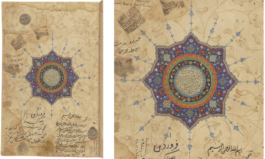
The copy opens with a titlepiece (unwan) in the form of a sun-shaped central illumination (shamsa) identifying the work and the author inside the circle. This title is then surrounded by detailed floral decoration and blue finials radiating outward. If you take a closer look at the page, you will notice gold flowers, stems, and leaves decorating the open areas around the shamsa all the way to the edges of the page. You probably also noticed the stamps and notes on the page. Let’s take a closer look at these since they can tell us some of where this manuscript lived before it came to Lafayette.
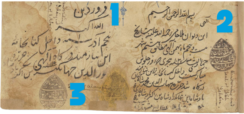
Starting along the lower part of the page, at the left side (number 1 in the image below) is a note dated year 1 and signed Nur al-Dīn Jahāngīr (r. 1605-1627). Jahāngīr was the son and successor to Akbar I and was the fourth Mughal Emperor. The note says this book was brought into the library on the 5th or Azar in that year, and also gives the corresponding Hijri year 1014, which is 1605 CE.
At the right (number 2 in the image below), we have a teardrop-shaped stamp and note saying the book was entered into the library on 25 Bahman, which coincides to 8 Jumada al-Thani in the year 1037, which is also the date of the beginning of Shāh Jahān’s reign, 14 February 1628 CE. The note is signed Shihāb al-Dīn Muhammad Shāh Jahān (r. 1628–1658) and the stamp is also dated 1037.
Moving back to the left a little bit, we have another teardrop-shaped stamp (number 3 in the image) dated 1070 with the name Muhyi al-Dīn Muhammad Alamgīr Pādishāh Ghāzī, but no note. The date and the name mean this is the seal of Aurangzeb (r. 1658-1707). The date on the stamp corresponds to 1659-1660 CE, which is early in his reign, but makes sense seeing as how this book has been entered into the library early (or even on the first day) in the reign of each new emperor.2
Traveling up to nearer the top of the page, we find a rectangular stamp and note from Ahmad ‘Alī Khān Bahādur, dated 1208 (1793–1794 CE) saying the book was in his possession for a few days. So, almost a century later, the book belongs to someone who loaned it out and was expecting it back. There is also a circular stamp up there, but I do not see a personal name or date on it, nor does it have an accompanying note.
There are at least a dozen other notes and stamps on the front flyleaves and last page that we will not go through in detail here. They show that this manuscript was transferred between librarians, loaned, and inspected numerous times.
On the back of the title page, we find that the work begins with two illustrations, both brightly colored and detailed. When open, these images would be on facing pages, so the reader would see them both together and not sequentially.
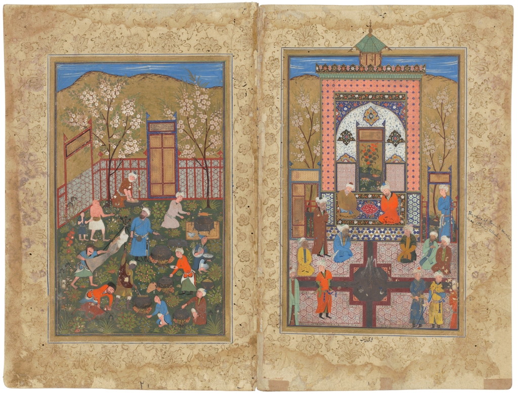
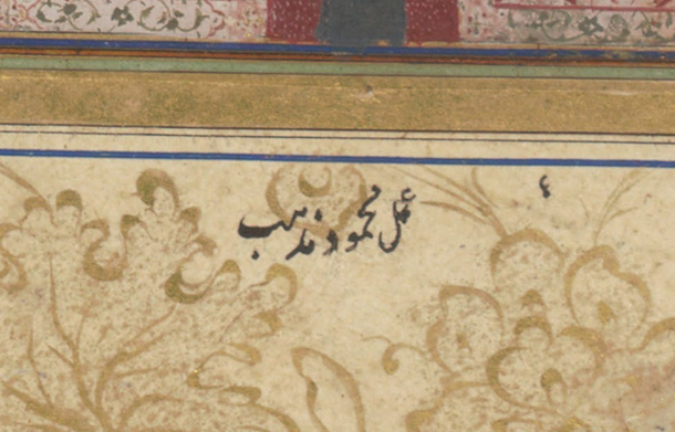
On the right side of the opening is an image of two people seated together that a later, European hand has labeled as the poet Jāmī and his murshid, which is a Sufi spiritual guide. I encourage you to open the full image and take some time to explore and appreciate all the details of the architectural decoration, for one. You may also notice that some of the central points on the floor tiling are reflecting light a little bit in the photo, which means they are gold. The water feature was likely a silver, but has oxidized over time. Also notice at the bottom of the image, just outside of the border rule is a little note that says that this is the work of Maḥmūd Muzahhib (see detail below). That’s the painter’s signature for this illustration, and all the illustrations in this copy are by the same painter.
The facing page illustration is a depiction of food preparation for a feast. Please take a close look at the painting and notice again, all the detail you can see not only in the characters depicted and their actions, but also in the setting. The fires under the pots, for instance, and all the little plants; the decoration on the crockery being carried and sitting waiting to be filled. The person in blue in the middle who looks like he’s about to stir a pot is also looking over his shoulder at the people approaching. The colors are still quite bright, and if you are interested in pigments and dyes used in Persian manuscripts, have a look at the Persian Manuscript Materials website where they have assembled recipes for the pigments used in work like this.
There are two more full-page illustrations in this copy, again set up as facing page images so they can be looked at as a unit. We will not look at them right now, but I urge you to open the viewer and take a close look at them both. Consider it a visual thinking strategies exercise where you spend 10 minutes looking at an image and then asking yourself these questions: 1) What’s going on in this picture? 2) What do you see that makes you say that? 3) What more can you find? This is a fun exercise to do with someone else because you will notice different things and can build off of each other’s comments. Try it! Illustration 3. Illustration 4. Persian paintings are great for this because there is often a lot going on all at once.
Returning to the beginning of this work, however, we are about to get to the text. The first part is an introduction in prose, the beginning of which is set into a dual-page illuminated frame, rich with detail. This frame establishes the color scheme for this work; the one larger headpiece (sarlawh) immediately following the second set of illustrations and the smaller headings throughout the copy that indicate a new section or poem match in terms of color and style. We know this first section is prose by the way the lines go across the whole textblock and are not in columns. Poetry, remember, will be written in columns, as we will see after this introduction.
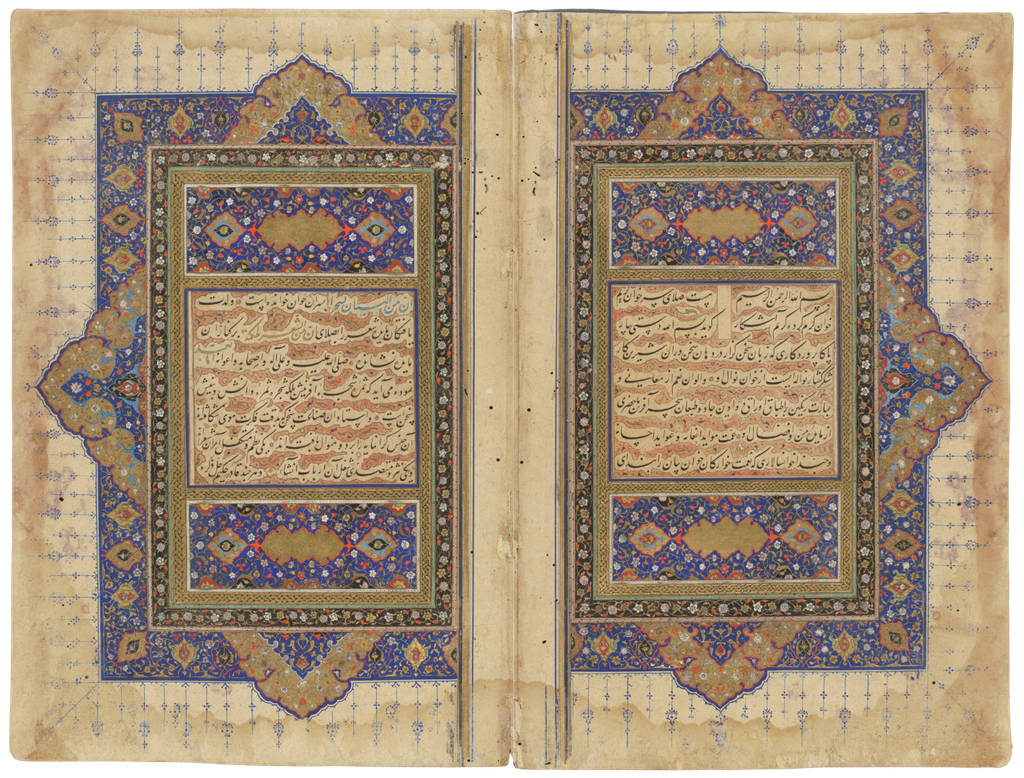
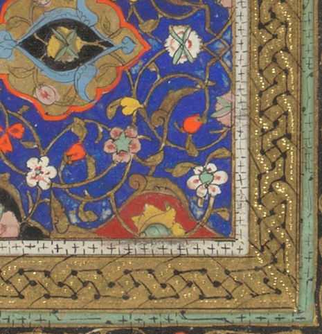
Again, please open the full view of one of the illuminated leaves to look at the detail of both the decoration and the script. You may notice the reddish cross-hatching in between the lines of script. That is a way of creating contour or cloud bands that highlight the text and make it appear almost to float above the page. While you are looking closely, notice also the gold band around the text where a pointed instrument has been used to make small indents into the gold that causes it to reflect in different ways. You can see this even in the professional photographs that generally do not show reflections. A detail of a corner of the illuminated leaf is below.
If you have been looking at the thumbnail images all in a row in the digital view, you will undoubtedly have noticed how the margins are changing color. There are two ways to get colored margins. One option is to mask the center where the text is and dye, gold sprinkle, stencil, or otherwise decorate the margins. The other is to add margins of a different paper, bevel and attach them with a thin adhesive to the text paper, and then add a set of border rules (jadval) over the join. This is called the “text panel and margin” technique (matn va hashieh or vassāli).3 Having not seen this manuscript in person, but seeing the pages described by Martinovitch as being “very heavy of various colors,”4 I would think that these are probably made using the text and margin technique. Corroborating this idea is a descriptive note in Persian at the end of the manuscript below the colophon that identifies the manuscript, the scribe and the painter and says the margins are made of colored paper.

There are about six margin colors that repeat in the copy: pink, yellow, cream, lighter blue, green, and darker blue. Because they are not modern dyes, the colors show variation in tone and intensity. In addition to the colors, the margins have gold painted decoration in the form of flowers, leaves and stems, with the larger flowers and leaves on the three outside margins and smaller flowers in the gutter margins.
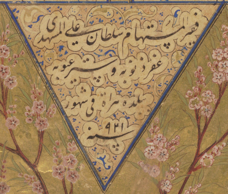
And now, the text. This copy was written out by the calligrapher Sulṭān ‘Alī al-Mashhadī (d. 1520), who is known for his remarkable ability in and refinement of the nasta‘liq script. He says in the colophon, image below, that this copy was completed in Herat in the year 921, which is 1515 CE. For those of you wondering if a calligrapher would copy more than one manuscript of this quality in the same year, the answer in this case is yes. There is another manuscript by this same calligrapher also dated to 921 A.H. and also copied in Herat that is preserved in the Razā Library, Rāmpūr, No. 755.5 Also, if you are curious to see for yourself how al-Mashhadī’s writing of nasta‘liq compares with other versions of this script, you can search in DS for the term nastaliq, filter for images and look. I imagine you will immediately notice differences between what you are seeing in this manuscript and other, more workaday versions of the nasta‘liq script.
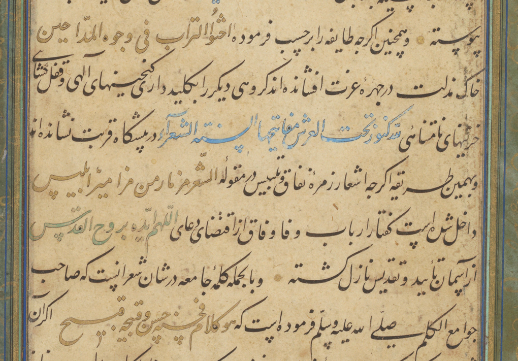
As mentioned above, prose will be written in long lines, so the beginning of this copy is in long lines and the rest, being poetry, is in columns. In this first section, certain phrases are set off by different colored inks. An image below shows a detail. The blue and gold inks are used here for citations of Arabic. The black is Persian. Using color to distinguish the two languages when they are copied together is not uncommon. Another way that distinction is made is to use a different script, such as naskh, for the Arabic.
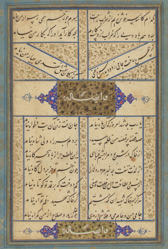
In later sections, the gold ink will occasionally be used for filling space or a brief heading before a poetic segment. More often than not, however, instead of a word in gold ink, the headings are illuminated panels with central gold cartouches decorated with black flowers, leaves, and stems on which has been written in white ink a phrase about what is coming next. See the detail below. Sometimes these headers are simple, such as those below that say “Also by him.” Other times, there will be a slightly more descriptive header identifying the type and topic of the poetry in the following section, for example. In terms of layout, notice how the lower poem in the example below is inset a little more and has bands filled with gold foliate decoration down both outer edges in addition to the intercolumnal fill that can be found on every page. Notice also that the calligrapher has decided to put one line at slight angles. Angled lines take up more room on the page for spacing purposes. In this case, it is so the poem following these will be entirely on one page instead of broken up with one line at the bottom of this page; it is like widow and orphan control in typesetting.
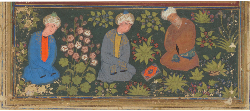
Let’s stop there for this month, though we could spend much more time looking closely at this copy. I’ll leave you with this detail of the fifth and final painting at the end of the manuscript of a teacher and students contemplating a book. I look forward to adding Lafayette’s manuscript data to DS when it is ready as well as that of the other new members who joined so far this year including: Dartmouth College, The J. Paul Getty Museum, Haverford College, the Morgan Library & Museum, Occidental College, Pepperdine University, The Athenaeum of Philadelphia, and Rollins College.
References
- Provenance notes provided by Lafayette College
- John Seyller does caution that, “the accession-day inscription must be taken as a convention invoking auspiciousness rather than as a factual record of the date upon which the emperor first handled the manuscript” (245). “The Inspection and Valuation of Manuscripts in the Imperial Mughal Library.” Artibus Asiae , 1997, Vol. 57, No. 3/4 (1997), pp. 243-349 https://www.jstor.org/stable/3249930
- Barkeshli, Mandana, Sadra Zekrgoo, and Nasim Koohkesh. “Seriš (Eremurus) Adhesive and Its Use in Traditional and Modern Iranian Manuscripts Conservation Practice.” Conservation Update 1 (2023): 6–33. doi: 10.48341/27w3-x748. See in particular page 8 where this technique is described, and Figure 1 of a modern repair using the same technique.
- Martinovitch, Nicolas N. “A Djāmī’s Manuscript in the Lafayette College Library.” Ars Islamica 1, no. 1 (1934): 128–29. http://www.jstor.org/stable/4515468.
- This was mentioned in a paper by Chander Shekhar “From the Desk of Abdur Rahim Khan e Khanan” that was looking at manuscript notes. The colophon and notes for manuscript number 755 are photographed in the paper. https://www.academia.edu/124316020/MUIYE_QALAM_E_ABDUR_RAHIM_KHAN_E_KHANAN_Copy